
Hi Everyone, We at CMC have been looking for a nice logo for our company and thought what would be better then to get some input from a forum we consider our home. We have been working hard on building a reliable system to house our quality corals as well as setting very reasonable pricing on our stock. As we move forward towards reaching our goal, we would like to get a interesting logo that would best represent CMC.
With that being said we have selected a poll to see if you can rate which one of the follow five marks you find most favorite to least in terms of memorability and overall first impression.. Any addition input or suggestions will be greatly appreciated.
Thanks,
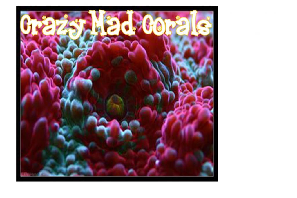
Crazy Mad Corals
1

2

3

4

5

With that being said we have selected a poll to see if you can rate which one of the follow five marks you find most favorite to least in terms of memorability and overall first impression.. Any addition input or suggestions will be greatly appreciated.
Thanks,
Crazy Mad Corals
1
2
3
4
5
")