1.What makes it an effective image?
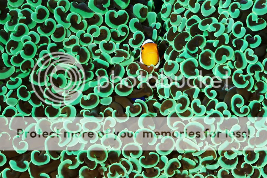
I love this shot!!! It is effective because you are immediately drawn to the clownfish (subject). There is a lot of humor in this shot and I smile every time I see it. The fact that is has adopted a hammer coral and also the look on his/hers face is priceless. Besides the beauty and great green color of the hammer coral really makes this image very appealing.
2. How was the photo/subject it lit? (you may not be able to tell for sure, but you should be aware of how images are being lit)
I think this image was shot with two flash units in a 45-degree angle from the front. The image is evenly exposed and there are really no shadows
3. Does the image capture the personality or essence of the subject?
Most definitely!! He/she looks a little lost and puzzled
4.Is there any question about what the main subject of the photo is?
No.
5. Is there anything that the Photographer could have been done technically to make this a better photo?
The image does not have much of a 3-d effect. Also, the head of the clownfish lack detail and is maybe a bit overexposed.

1. What makes it an effective image?
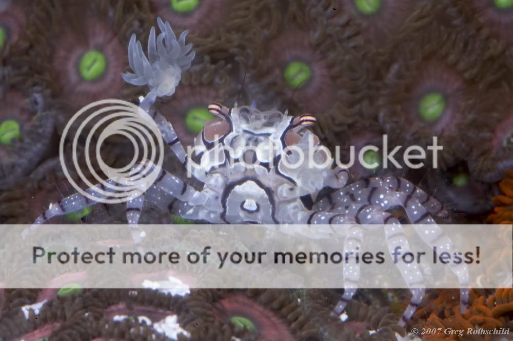
I like how the foreground (in focus) draws you eyes into the subject. Also the background is out of focus, which emphasizes the subject. The pom pom boxer crab stands out because of the lighter body compared to the darker fore and background.
2. How was the photo/subject it lit? (you may not be able to tell for sure, but you should be aware of how images are being lit)
Either natural light or flash from above – perhaps even bounced flash since the light seems fairly soft.
3. Does the image capture the personality or essence of the subject?
Yes. Can you see the resemblance between the pom pom boxer crab and a cheerleader? Especially with that one pom pom in the air(water)
4. Is there any question about what the main subject of the photo is?
No.
5. Is there anything that the Photographer could have been done technically to make this a better photo?
Not in my opinion
P.S. I had no idea pom-pom boxer crabs were so hairy

1. Why did the image fail?
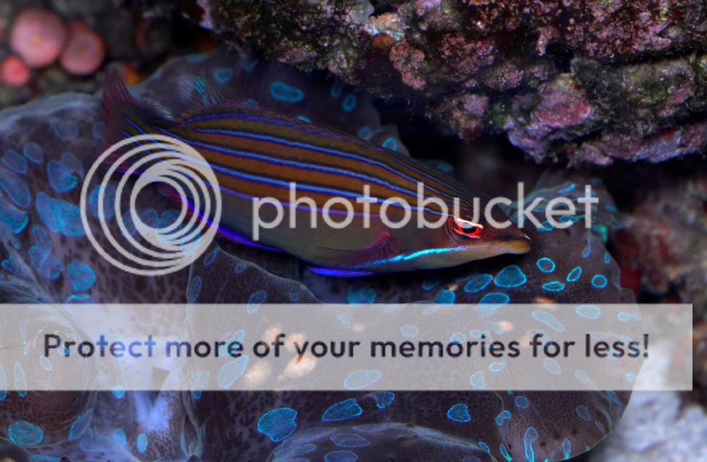
First of all – it is very easy to find a bad image on the web. I chose one that some people may say is a good picture, but considering what we have learned so far I would like to disagree. This image fails because it is not clear what the subject is. Since everything is in focus it is not clear if the subject is the giant clam or the sixline wrasse. Also, the sixline wrasse basically blends in with the clam. Some people would say: “wow that is a nice clam and a nice wrasse”, but it is really not an effective photograph.
2. Is it clear what the actual subject of the image is?
No.
2. How is the exposure?
The image is underexposed. It looks like no flash was used.
Is the color balance for the image accurate?
I think the color balance is fairly accurate, but the blue colors dominate the picture, which gives the impression that blue is weighed too heavy.
3.How is the focus and depth-of-field in the image?
This is one example of a too wide depth of field. If the photographer had used a more narrow DOF the wrasse could have been framed as the subject more effectively. The focus is terrible because the clam is in focus and the wrasse is slightly out of focus (this adds to the confusion about what the subject is).
4. Are all the necessary parts of the subject in focus?
No – see above
b. Are there image elements that are visually confusing or distracting because there is too much in focus?
Yes (again see above)
4. What could the Photographer have done to make this a better photo?
The picture could have been improved by a more narrow DOF allowing only the wrasse to be in focus. The use of flash would have improved this picture and brought out better colors for the wrasse. Also, a blue foreground is not the best to portray a fish that have a lot of blue in it.


